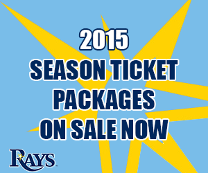
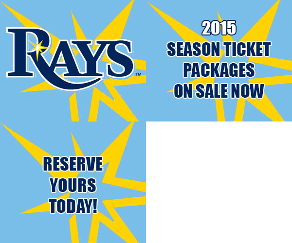
My Digital Imagery assignment this week was to create a few different sized banner ads in Photoshop, including one animated one. We needed to make ads for Q1 – 2015, so I went with the Tampa Bay Rays season tickets, since the season begins in Spring 2015.
I am not affiliated with the Rays in anyway, and the banner ads below are for educational purposes only.
It was kind of difficult designing ads that had the same look and feel, despite being both vertical, horizontal and square, but since the Rays had 4 different logos that I could use, it allowed me to switch up the looks, but still keeping the feel similar. I used the “RAYS” Logotype, the logotype set in a baseball diamond, the alternate “Devil Ray” logo and the alternate starburst logo.
I utilized the Rays logo for horizontal Leaderboard and square banners, because it is horizontally shaped as well, but for the vertical, Skyscraper banner, the diamond logo seemed to fit better. I used the “Devil Ray” logo in two different ways depending due to the dimensions of the banners as well. For the skinny leaderboard, I cropped the ray in a way that filled the space and made it look much larger compared to everything else, while still being able to know tell what it is, despite not seeing the whole image. Since that wouldn’t really work on the Skyscraper, I made the ray smaller you could tell what it was and it just made more sense.
I used the alternate starburst logo in every banner ad except the Skyscraper, because it gives a nice accent to the dark and light blues, but it just didn’t seem to fit right with the tall vertical banner. Fortunately, the Rays logo includes a small version of the starburst.
The banners were supposed to have a “call to action”, but every time I tried to add text or a button saying, “click here” or something like that, it just seemed cluttered. I did include a line on the animated ad telling people to “Reserve yours today”, but I don’t think telling someone to click an add is going to actually influence their decision to click, at least in this case. It is implied that since season tickets are now available or on sale, you can go and buy them if you want to. Not really that you should, but just letting you know that you can, where as you could not previously. Maybe that’s not very good marketing, but I’m not sure if banner ads are really that effective at directly leading to sales, but visually good ones, that are well placed can and do leave impressions on people’s mind. Especially when they are targeted towards people who have cookies (internet history) that suggest they would be interested in the product.


